|
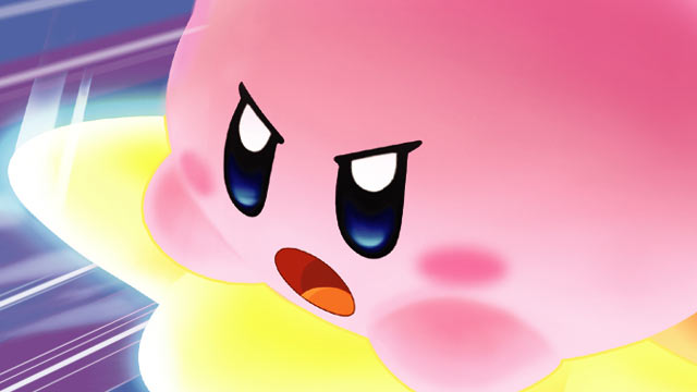
Kirby’s Epic Yarn represents the first for Kirby in many ways. Perhaps most notably, it marks the first American box art where Kirby is not furious. See below:
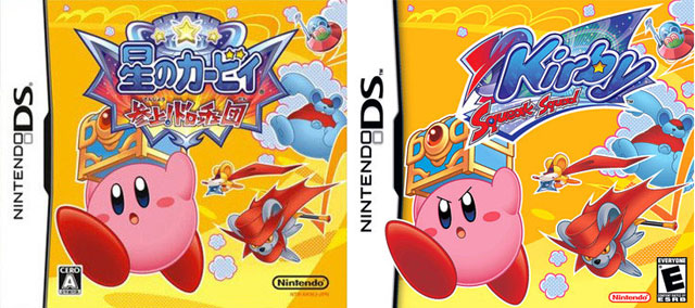
Kirby is clearly being made “tougher” to appeal to more hard-scrabble American audiences, who just wouldn’t take to a happy pink puffball, but who find a furious one irresistible. But what if other game characters started following Kirby’s lead? A terrifying world filled with fury, or a world of pure awesome?
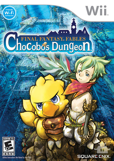
Chocobo may be a tough hero on the inside, but after this revamped box art hits the shelves, it’s going to be obvious from look one. This Chocobo isn’t going to take crap from any Moogles, Malboros, or annoying kid sidekicks! WARK!
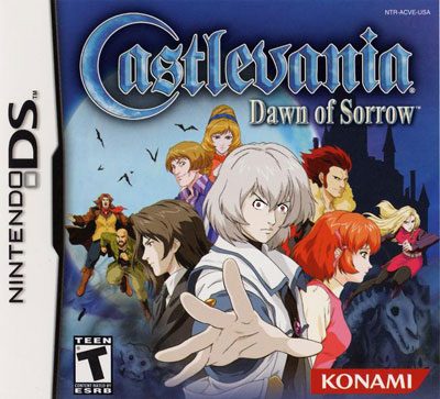
There was a vocal majority of gamers who were highly dissatisfied with Dawn of Sorrow’s more traditional art style when compared with the more gothic stylings of Ayami Kojima. Fortunately, everyone on the cover has now toughened up nicely.
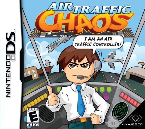
Being an air traffic controller is a frustrating job. The original box art made it seem fun, but I think this new look more accurately conveys the real feeling of being an air traffic controller — or of playing the game, for that matter.
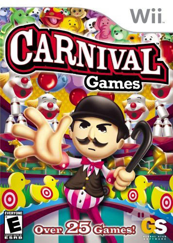
The Carnival Games ring master is understandably upset with the quality of his games, and he is now visibly demonstrating this on the cover. The most appropriate cover yet.
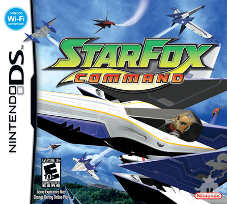
Fox looked kind of bland before, but now he’s a Pigma-trouncing machine. This subtle enhancement invigorates an already competent DS game into a roid-induced masterpiece.
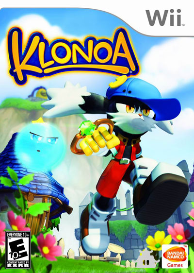
It’s hard to take Klonoa seriously with mad-eyes like this, but it may be just the ticket to get his game to sell more than five thousand copies worldwide. God bless you, little cat-rabbit guy!
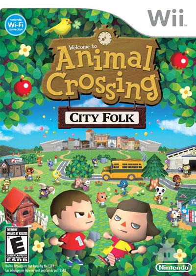
If there’s one thing that Animal Crossing needs, it’s more anger. Think of the FPS fanatics who’d switch over after seeing a testosterone-infused cover like this!
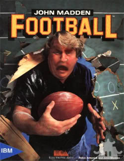
John Madden bursts through way too many walls to NOT be horrendously angry. Plus, he coached for the Raiders, right?
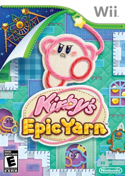
And, while we’re at it, let’s take a look at what Kirby’s latest adventure would look like if Nintendo had decided to do it the right way. BAM. Pure effectiveness.
Graphics work by M. Noah Ward.


 ShareThis





That John Madden on had me laughing until it hurt. I definitely want to play each and every one of these games about 10,000,000.23 times more now.
This was a damn clever article. I would actually play Madden if that were the box art, because that’s how shallow I am.
“Madden ANGRY!! Rawrr!”
LOL I’m glad you guys liked the box arts :)
P.S. This was a tag-team piece. I originally had my name in the byline on this story by accident: it was Aaron who came up with the text and selected the games to be featured. I’m just the graphics dude. Thank you Aaron! :)
lol, carnival games guy just looks downright creepy like that.
Does Carnival Games Guy have a name? I’ve never played the thing. But it looks like here his name should be Creepy McCreepCreep.
creepy mcreepcreep works… I’m having flashbacks to this horrible nes game I played back in the day where two kids are stuck at some spooky carnival. wish I could remember the name. He does look ready for smash bros now tho
Well Aaron, you are a god of humor. Great job!