
THQ Unveils New Logo
Following in the footsteps of Gap and MySpace, THQ has unveiled their own poorly designed logo. Granted, it’s hard to do much worse than their original logo, but we’ll let you be the judge! Take a gander below:
THQ President and CEO Brian Farrell said that logo “…epitomizes the change, innovation and creative growth that are the cornerstones of the new THQ. By developing triple-A, innovative, original intellectual properties, attracting the top talent in the industry, and placing that talent first, THQ continues to redefine itself. This new logo seeks to capture that change and make it tangible.”
What do you think? Did THQ need the change, or is this a poor decision through and through? Sound off in the comments below.
Source: THQ press release
Friend codes for 3DS?
The Friend Code system– Nintendo’s method of connecting its systems’ players via the internets– is undoubtedly the greatest method of online gameplay. Therefore, it should make all Nintendo fans’ hearts go pitter-patter if the latest issue of Famitsu is to be believed.
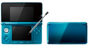
Nintendo’s clumsy method for connecting Wii and Nintendo DS players to others online, the dreaded Friend Code system, may be returning for the Nintendo 3DS if a report from magazine Famitsu is accurate. According to Kotaku, the magazine featured a preview of Street Fighter IV 3D, and in it, reference to the awesome end all and be all of online gaming contact management was mentioned. Hopefully come January 19– the day Nintendo shows off the 3DS to the American public– we will have more information.
Source: Kotaku
Latest Pokémon titles selling OK in Japan
Pokémon is just the little franchise that could. Laughing in the face of doom, Pokémon Black and Pokémon White were released on Nintendo DS in its twilight age, just a few months before 3DS’ release in Japan. As if the initial 2.6 million combined units sold in the first two days wasn’t enough, combined sales have now topped over 5 million units, after little more than 17 weeks. Not only that, but we’re talking pre-United States release. Impressive, no?
Source: Joystiq


 ShareThis





Honestly, I like THQ’s new logo. It feels very clean to me, from a design standpoint.
I think THQ’s logo is a definite improvement over the last one, which felt a little ’90s. But as I read somewhere else, I do tend to over-focus on the point where the T and the broken H touch. I like the Q but it doesn’t seem to go with the rest of the design.
The logo kind of reminds me of Komatsu’s: http://www.komatsuamerica.com/
Amusingly, THQ originally stood for “Toy Headquarters”. Knowing that, this logo says… “Toy… head… QUARTERS!!!”
Toy… Head… Quarters?
Ha HA! Double entendre!