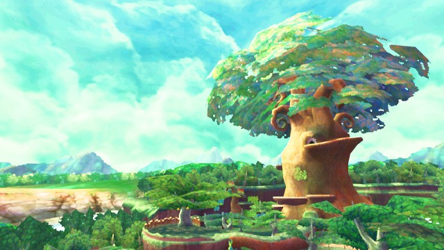
E3 2010 held a veritable wealth of surprises in store for Nintendo fans, among them the first glimpse at the newest Legend of Zelda title. Prior to the event, only a single piece of concept art for the game had been revealed, and its stylistic similarities to Twilight Princess led many fans, rightfully, to believe it would feature the same visuals as its direct predecessor. When the curtain had finally been drawn back, however, many were surprised to see the game sport what had been erroneously described as a melding of Wind Waker’s and Twilight Princess’s art styles. Miyamoto corrected this misconception in interviews following the reveal, but he only briefly touched upon the title’s artistic influences. We take a closer look at the movement that inspired this radical change and see how Skyward Sword attempts to mimic it through its visuals.
The seeds of what would become Impressionism were initially sown in 19th-century France. Borne out of a rebellion against the rules and conventions of academic painting, the movement began as a close-knit group of painters exploring their own artistic identities and eventually grew into a veritable phenomenon. Weary of the Académie dex Beaux-Arts and its narrow definition of what constitutes true art, these painters broke away from tradition and established their own shows to exhibit their unorthodox works. Critic Louis Leroy derisively labeled the resulting movement “Impressionism” in a review of Monet’s seminal painting, Impression, Sunrise, claiming the work resembled more an unfinished sketch than a completed painting. Monet and his colleagues, however, took the name with pride, and the movement gradually gained critical and public acceptance through these continued exhibitions.
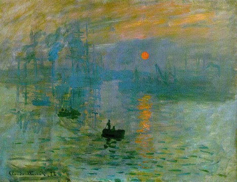
Impressionist works are most famously characterized by their thick, visible brush strokes as opposed to the thin, suppressed ones found in more traditional pieces of art. This technique helped Impressionist painters more easily capture the “essence” of the object they were painting without being mired in needless detail. Colors were applied side-by-side rather than being mixed, creating more vibrant surfaces that contrasted starkly with the darker toned works being championed by the Académie. These colors were also applied before the paint could fully dry, producing softer edges than traditional approaches allowed. Such techniques were not altogether uncommon in painting, but they had never before been used in combination with one another, creating works that not only looked fresh but were also original in their composition.
Equally innovative of the movement was its choice of subject matter. Academic art placed a great importance on historical and religious themes, and traditionalists strove to depict these in their works as realistically as possible; Impressionists, however, chose more common subjects as the focus of their art, shifting their gazes on ordinary people in everyday settings and scenarios. Such a change was considerably radical for the time, and it effectively paved the way for similar revolutions in other artistic mediums.
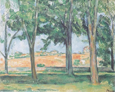
With this in mind, it is much easier to identify the Impressionist influences in Skyward Sword’s visuals. Immediately striking are the environments, comprised not of realistic textures but of various colors seemingly dabbed together. This gives the game’s landscapes a similar look and feel to those found in impressionist paintings– the precipice pictured below, for example, really achieves this effect through its juxtaposition of colors, and the field in the screenshot further still closely emulates the one in the above Cézanne piece. Both forgo the level of detail found in Twilight Princess for a distinctly more “simple” look, instead capturing the general impression of the objects they are trying to depict.
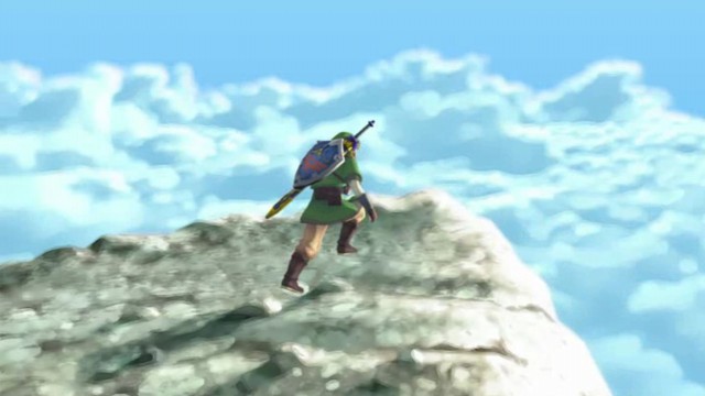
This is perhaps most evident in Link himself. Despite being based upon the same character model, Skyward Sword’s variation of the elfin hero is strikingly more “simple,” for lack of a better word, than Twilight Princess’s— where once the minutest stitchings in his tunic could be seen, his attire is now comprised primarily of solid colors with as little unnecessary detail as possible. Proponents of realism will undoubtedly bemoan this lack of visual fidelity, but it is very much in keeping with the spirit of Impressionism, placing a greater importance on the “impression” of an object rather than the details which comprise it.
Other characters have also undergone a similar stylistic simplification: Keese sport a much cartoonier look than their relatives in Twilight Princess, and Bokoblins have been completely redesigned to look chubbier and less goblin-like in appearance. This is nothing to say of the game’s environments, which most apparently emulate their Impressionist influences: trees, particularly the one towering above the wooded demo area, are far less realistic in their proportions, and the bulbous mushrooms scattered about the forest are more stylistically akin to those in the original Super Mario Bros. than any in the Zelda series. All of these elements combine to create a unique look, one that simultaneously deconstructs and enlivens the style employed by Twilight Princess without rendering it unrecognizable.
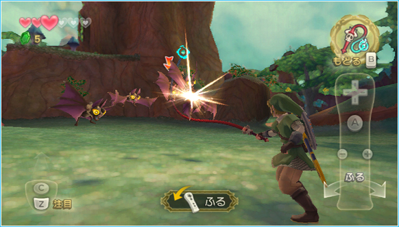
It is also interesting to note the circumstantial similarities between Skyward Sword and Impressionism. The title’s immediate predecessor, Twilight Princess, featured distinctly more “realistic” visuals than any previous entry in the series, and its color palette was comprised predominantly of more somber shades of brown and green. These facets lent a decidedly serious atmosphere to the game, making it one of the darker entries in the series. Skyward Sword, much like the movement on which its visuals are based, is a stylistic reaction to this approach: its color palette is immediately more vibrant than that of Twilight Princess, and the level of realism found in the latter has been purposely eschewed for a comparatively looser and more exaggerated approach to character and environmental design. This radical change has received the scorn of many gaming enthusiasts, who value the “realistic” look Twilight Princess and countless other titles on the market employ, but it has gradually come to be accepted as an equally-viable approach to in-game visuals and is gaining quite a vocal following.
Skyward Sword may still be far off from seeing a retail release, but Nintendo will no doubt continue to refine the game’s visuals in the months leading up to then. It is unlikely the series will employ the same art style in future installments, given the relative frequency with which it changes graphical approaches, but if anything that will simply give Skyward Sword a special place in the annals of the franchise– not only is it the first game in the series designed expressly to illustrate the potential of Wii MotionPlus, but it is also arguably the most experimental and sophisticated in terms of its art. What the game is ultimately remembered for can only be determined by time, but its Impressionistic visuals will surely rank among its most memorable– and most important– aspects.


 ShareThis





Fantastic article, I really don’t think many gamers give it this much thought, and it’s refreshing to see.
Thank you very much. I’m really glad you liked it. :)
It took me a while to fully embrace the look of Wind Waker. I was probably a little bit skeptical right up until I actually played it.
Skyward Sword, I’m immediately sold on. It’s a differently-exotic style than Wind Waker’s, one I find more appealing even in screenshots, but I also have gotten past the notion that a Zelda game should look anything at all like the previous ones.
Heck, Okami looks nothing like … any other game I’ve ever played, and it’s still one of my favourite Zeldas. ;^)
I felt the same about Wind Waker. After the Spaceworld 2000 demo, I was among the many who were disappointed by the radical change in graphics. Gradually, though, they grew on me, and I really began to appreciate them when I first saw them in motion.
Like you, I have since given up on the idea that a Zelda game has to conform to the same art style as previous ones, and I think that was one of the reasons I was more immediately receptive to Skyward Sword’s visuals. The series would get stale if each installment looked more or less the same, and I’m glad Nintendo has the courage to shake it up (at least artistically) every now and then.