ShareThis
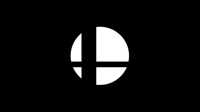
The Super Smash Bros. logo is certainly iconic, but it’s actually also a great example of symbolic graphic design. In a video recently shared on Nintendo’s official Japanese YouTube channel, Masahiro Sakurai revisited what the logo actually represents.
The two lines that form a cross are meant to symbolize the crossover of all of the different Nintendo characters and worlds in the game (and that now includes external franchises), while the four sections that the circle are cut into represent the four-player aspect of the game — although the games now support up to eight players, as of Super Smash Bros. for Wii U.
Twitter user @FarmboyinJapan translated and tweeted about the video:
In a recent video on Nintendo Japan’s Youtube channel, Sakurai was asked what the Smash logo is supposed to represent. He said that the intersecting lines are meant to show the “crossover” nature of the series and the circle divided into 4 sections represents 4 person multiplayer pic.twitter.com/9vZ5iU5cRr
— Kyle McLain (@FarmboyinJapan) December 14, 2018
Sakurai is talking about this again now due to the recent release of Super Smash Bros. Ultimate, but this isn’t a new revelation — Nintendo explained the meaning of the series’ logo way back when Super Smash Bros. launched on Nintendo 64. That was quite some time ago though and a refresher is always nice!
Source: Nintendo Life