


 ShareThis
Every now and then a brand-new creature comes along and gives cryptozoologists a purpose; and rightfully so. The deep desire to discover a crimson echidna with naturally be-gloved, brass knuckles seems almost universal. But how could anyone be happy to unearth a blind land snake with inutile wings? Or a lookalike of a renowned seafarer whose primary difference is an unsightly lump on its head? And even more so, who would create such monstrosities and willingly place them into their own abstract world? These are the questions I will now consider.
There are two ways to evaluate art. First, we decide whether or not we like it. This always happens first. This decides whether we keep watching or not. We all have tastes, and we all choose what those tastes are.
The second way to evaluate art is critically. Despite popular opinion, true criticism operates without bias. The world, for the most part, believes that personal critique can only be an opinion at best. But this can’t be true. We can view a work of art, whether it be a movie, book, song, or painting, and say whether it is good or not. We can say whether or not that work of art has a truthful message. And the truth will always edify. I say again: the truth will always edify.
Choosing the ten Pokémon that deserve the least esteem was indeed a delicate task. Game Freak’s record up to date has given gamers much satisfaction as far as quality and value goes so much so that we easily grow attached to our favorite featured Pokémon, even in other mediums. However, a handful of the ever-increasing cast of critters (this writer could find no more than 30) suck immensely. And I’m not talking about Heracross’ kind of sucking; this is about critiquing the cream of the crappiest.
To be fair, all pictures I feature below have come from the brilliant hand of Ken Sugimori. His artwork has always been magnificent, and I feel it is only right to assess Pokémon filtered through the kaleidoscope of his definitive designs. I am sure my list will find contest; this business is much too large to be dealt with over the interconnected nets. But if we are willing to set aside our own inclinations and view Pokémon solely from an artistic standpoint, we may find that we agree on more than we do not.
#10
Mudkip
Generation: Third

Everybody lieks mudkipz.
This blue fish (?) is the most hated starter Pokémon ever, as well it should be. In fact, for years it has been the subject matter of one of the most popular gaming memes. That design is so ridiculous– I mean, who ever heard of a head fin? Wouldn’t that kind of be like, an inconvenience? And the mere expansion of its body through its two evolutions certainly doesn’t help it get any better. As a testament to Mudkip’s epic failure, my brother and I quickly chose Treecko and Torchic as our starters on Ruby and Sapphire and forcefully made our best friend choose Mudkip. Well, as it would happen, he quit everything Pokémon (cards, games, cartoon) within a month and has to this day not returned.
#9
Budew
Generation: Fourth

Um, what can Budew do?
It’s easy to see Roselia and Roserade as great Pokémon. But did you know they both can start out as this disaster? The spiral hair and evergreen bib pattern (that could pass for an Amish beard) both aid in making Budew a Budon’t.
#8
Igglybuff
Generation: Second

It’s Jiggly–! Oh, wait…
There comes a time when cuteness goes overboard, and there can be no better example of this than Igglybuff. The artists basically took Jigglypuff and changed her from a balloon into a cream puff– a hideously creepy cream puff.
#7
Burmy
Generation: Fourth

Because one design wasn’t bad enough.
Burmy are bagworms that stare blankly and hang from branches. The species comes in three variations, all of which are exceedingly boring. While its female variant evolves into a bigger version of the same bland monster, the male evolution, Mothim, actually manages to reverse the tawdry trend and become surprisingly worthwhile.
#6
Dunsparce
Generation: Second

I can honestly say my childhood would have been better without Dunsparce.
The only purpose Dunsparce has ever served to me and my friends was to act as the butt of a thousand jokes. But I suppose it is still possible that it could one day evolve into a cool Pokémon. Still, that wouldn’t vindicate the 11+ years we’ve had to bear with its sublime abysmality as is.
#5
Phione
Generation: Fourth

If you rearrange the letters of its name, you get Phonie… and iPhone.
If I could erase any Pokémon, it would probably be Phione. It is the most unnecessary addition ever to the lineup when you consider that Manaphy is ten million times better in every regard. There is no justification whatsoever for wasting the space and time it took to create this lesser clone. All the facepalms that have ever taken place across the globe over Phione’s meaningless existence are entirely understandable. In fact, I’m doing one now.
#4
Larvesta
Generation: Fifth

Thank you, Game Freak, for supplying the emo crowd with a mascot.
Words can scarcely express how excited I was near the end of the first quest on Pokémon White when a stranger on Route 18 handed me a special egg; nor can they express how disappointed I was when it hatched into Larvesta. Those clashing colors and quirkily misplaced hands are simply atrocious.
#3
Luvdisc
Generation: Third

Luvdisc are Torchic that a Snorlax accidentally sat on.
If this were a debate over the Pokémon that had the least effort put into its design, the winner would unanimously come out as Luvdisc. There is nothing exciting about it– no pizzazz, no superior evolution to look forward to, no limbs, no nothing. Luvdisc was probably created to be a Valentine’s Day gimmick– and it couldn’t even succeed at that.
#2
Stunfisk
Generation: Fifth
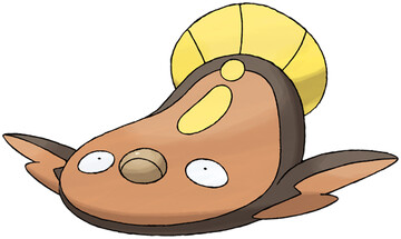
One word: Derp.
At his first sight of Stunfisk, my older brother said that it looked like roadkill. I know it’s supposed to be a fish, but it does also kind of resemble a squished owl, doesn’t it? Just looking at it can get you depressed.
#1
Gulpin
Generation: Third

Someone sneezed into a tissue and tried to pass it off as a Pokémon.
Gulpin is (literally) a poisonous, green stomach with a feather sprouting out of its head. ‘Nuff said.
It is interesting to note that I did not include any Pokémon from the first generation on my list. I suppose this is either because I am too nostalgic of them to realize their inadequacies or because they all truly do seem especially refined when thrown into the ring with the lot of today’s worst Pokémon. Well, I hope you enjoyed reading this as much as I did writing it. Feel free to make your own list below, or flame me to death for including your favorite critter on mine. I did, after all, hear you liked Mudkipz.


The only one I really agree with is Phione, which is so derivative of Manaphy that it isn’t even funny.
I actually find some the designs pretty clever. The very fact that they so accurate emulate nature (stunfisk, larvesta, burmy) makes them interesting, even if they aren’t beautiful works of art. Remember that not all art need be pleasing to the eye.
There’s a reason Phione looks so similar to Manaphy. ;)
http://bulbanews.bulbagarden.net/wiki/On_the_Origin_of_Species:_Manaphy_and_Phione
And I actually like most of these designs, too. They actually look like (stylized versions of) the creatures they’re based on. I was expecting to see sillier ones like Grimer/Muk, Voltorb/Electrode, or Mr. Mime. *shudders*
Grimer is totally not silly! You want silly, let’s talk the American-made Pokemon. Vanilluxe, anyone?
http://bulbapedia.bulbagarden.net/wiki/Vanilluxe_%28Pok%C3%A9mon%29
At least it actually looks different from its pre-evolutions. :p
Caveat: I do totally like Vanillite’s art, though. I had it on my team for a good while and then it evolved and–
cry
So what I’m gathering from all of these comments is that you peeple rly liek mudkipz. Remember, this is not a list of my most hated PKMN at all. Any that are included in it is merely coincidental. When I wrote this I was going for lamest all-around (designs/stats/uselessness); and I looked through pretty much every critter’s Sugimori art in order to evaluate them on the highest level.
And Andrew – the American designer hardly made the absolute worst Pokemon of the 5th Gen. You shouldn’t attack him just because he isn’t Japanese. We all knew this day was coming. XD
I’m absolutely against racial stereotyping and so should we all. Regardless of the ethnicity of the designer, we shoud all accept that Vanilluxe is the *worst* ever loking Pokémon and that’s what’s important.
I generally find the fish lazy. Sure things like Relicanth, Feebas and Goldeen may not be the most exciting Pokémon but at least they have solid designs. Carvanha and Basculin are likes different coloured clones and no one likes piranha anyway.
PS – Whiscash looks silly.
I made a vow not to include any plain fish or cocoons on this list because I felt it wasn’t fair – they are meant to be excessively simple.
@Adam: My problem with the Vanilla trio is that the last form so should have been a snowman. Personally, I think Hydreigon is a terrible design ripped straight from a bad Yu-Gi-Oh! monster. I was actually surprised to discover neither it nor Druddigon was made by the American artist.
PS – Golett and Golurk are cool Americamon.
Oh yeah, Golett and Golurk! Yeah, I guess they’re okay. I suppose what I meant was “you want silly, let’s look at these Pokemon lovingly inspired by soft serve ice cream.”
Soft. Serve. Ice. Cream.
Or as we just call it in Scotland: ice cream.
There is an absurd lack of Trubbish in this article.