Bits & Bytes is a weekly column where Editor-in-Chief Robert shares his thoughts about video games and the industry on a lazy Sunday. Light reading for a day of rest, Bits & Bytes is short, to the point, and something to read with a nice drink.
Playing The Legend of Zelda: Skyward Sword HD was a lot of fun, particularly because the team at Tantalus, the Australian studio that handled the game, got something right that Grezzo did not when it handled the remakes of Ocarina of Time and Majora’s Mask for 3DS. That something was mimicking the font and text scroll of Skyward Sword on Wii. I know that might not sound like such a big deal, but hear me out.
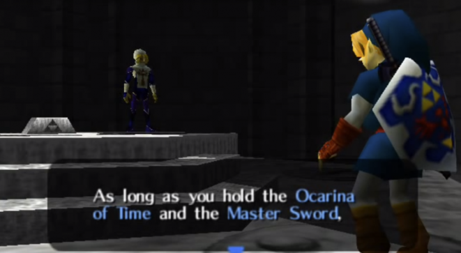
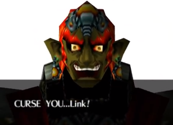
When playing any of the incarnations of the original Ocarina of Time, one thing that might slip past unnoticed is the way that Nintendo used scrolling text to great effect. The words don’t simply pop into existence on the screen. Instead, they scroll at a deliberate pace in order to convey emotion. There’s no voice acting in Ocarina of Time, so all of the dialogue is transmitted to the player via reading. In more traditional media like books, words are static images on the page, so any “acting,” or conveying of emotion, is going to fall on the reader to help fill in.
The result of these omissions is a lifeless text scroll that abandoned all of the nuance and intent of the original. While I enjoyed both of the Zelda remakes on 3DS, the impact that mucking with the text scroll and font of both games was something that never escaped my notice. However, this time around with Skyward Sword HD, Tantalus did an excellent job of maintaining the look and feel of the text and scroll found in the original Wii version of the game. Like Ocarina, Skyward is a voiceless affair, so paying attention to how dialogue was delivered in the first iteration of Skyward Sword was key to providing as authentic an experience as possible on Switch.
One gripe I do have with the text in Skyward Sword HD, though, is that it’s too small! Why do modern game devs do this? The TVs keep getting bigger and the picture crisper, and in turn designers keep shrinking the text. Enough already!


 ShareThis


I’ve been out-pedantic’d! That is a completely fair point about OoT’s 3DS remake, which I somehow did not notice, despite having devoured every rendition of that game multiple times. (Maybe I know the story so well that I just mashed through all the text…)
But more importantly, I am in furious agreement about teeny tiny fonts in modern games. Just because 80-inch TVs exist, doesn’t mean everybody has one! Dark Crystal Tactics and Empire of Sin are fine in handheld mode, but inscrutable squint-fests on a TV.