


 ShareThis
6. Street Hockey ’95 (SNES, 1994)
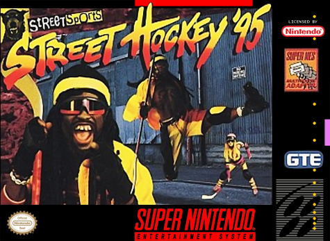
I played plenty of street hockey back in the ’90s, but never once did I dress up like a total asshole like this guy. For whatever reason, this whole cover feels like a deleted scene ripped out of the movie Waterworld thanks to the acrobatic jump-kick and girl equipped with headgear, goggles, and a stone-cold stare. More importantly, though, that backdrop looks less like a location where you’d play outdoor sports, and more like a place where you would step on a dirty drug needle and/or get shank’d. Street hockey was apparently rough business almost twenty years ago.


I’ve got to disagree. Iron Sword’s box art is amazing.
Im with you on this one, that box is amazing, looks like the mule box, and also like connan, which in my book is pretty awesome.
You’ve just go to know there is a very interesting story about how that particular box art came to be.
Tell me about it.
HA! I never did like Where in Time. They’re looking shocked cause Carmen just popped out of nowhere, but I have to agree; it DOES look like a bad Meatloaf video!
The worst of the buch is the blue haired dude one, yuck!
And the sad thing is, that game is actually quite good. I remember playing it back when I was a kid, and I had a lot of fun with it. IGN seemed to like it a lot too. http://m.ign.com/articles/2003/01/15/karnaaj-rally
Yeah 8.8 is a high review, checking it.